Skip to content
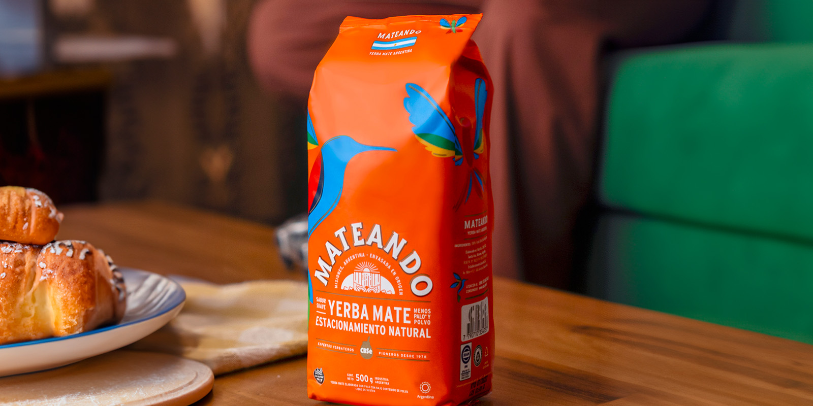
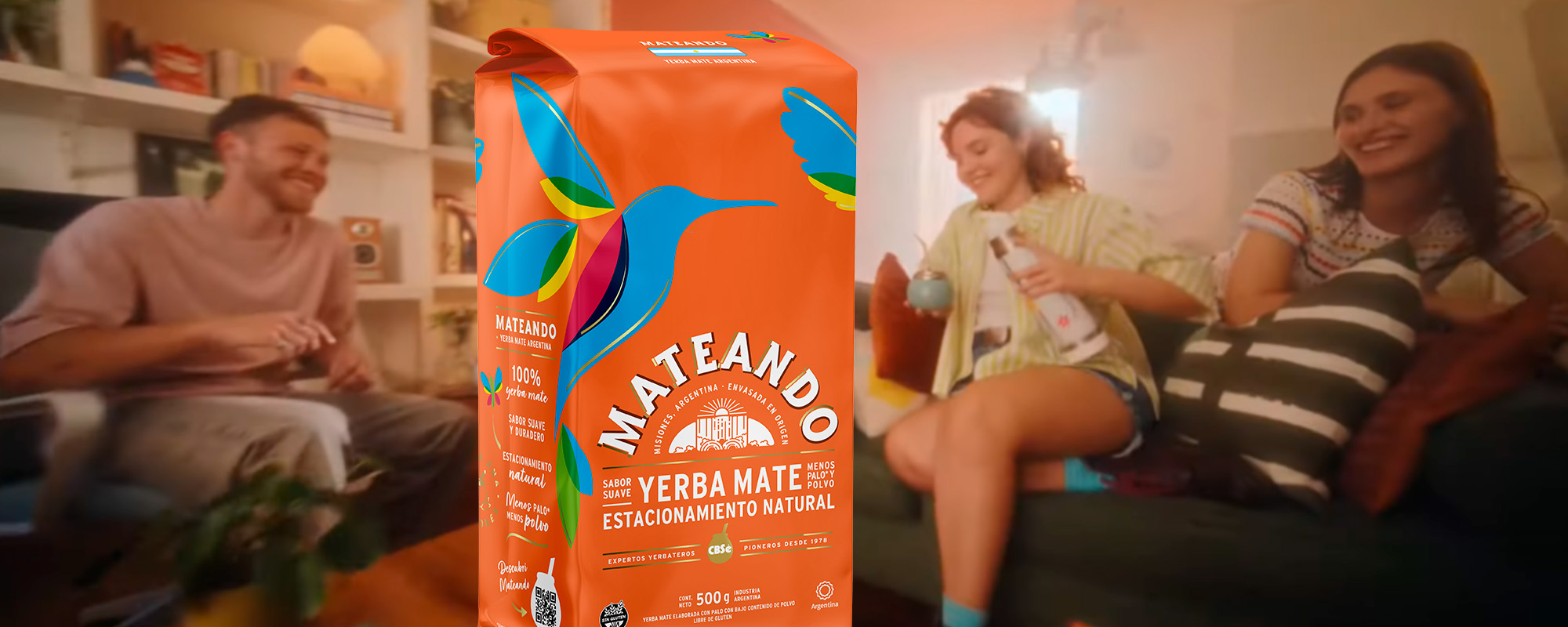
Grupo de jóvenes riendo y compartiendo un mate en una sala de estar, con un paquete de yerba Mateando en primer plano, destacando su diseño colorido y natural. Diseño de packaging por Tridimage.

Breaking Into a Traditional Category With Disruptive Design

Mercado del proyecto

  • Argentina

    Imagen de la Bandera de Argentina

Mateando – Establecimiento Santa Ana

1. The Challenge

Revolutionizing the Yerba Mate Market

Establecimiento Santa Ana, the undisputed leader in Argentina's flavored and blended yerba mate market with their CBSé brand, set themselves an unusual challenge: to enter the category's largest and most traditional segment.

To achieve their goal, they needed a distinctive proposal that would set them apart from existing supermarket brands. The major challenge for our team was to develop a unique visual system that would not only generate commercial impact but also build an iconic image capable of captivating an audience seeking extraordinary experiences.

Mateando needed to maintain CBSé's disruptive essence while establishing its own identity. The new brand had to convey joy and connect with young-spirited people who genuinely enjoy "mate moments."

We really appreciated that Tridimage had methodologies that helped us put into words what we were looking for. It was a very pleasant process. We quickly understood the logic they proposed, adapted very rapidly, and found it highly productive. We know these creative processes involve co-creation, and having a team that guided the project's development was crucial in achieving the packaging we obtained.
Sol Orquera

Sol Orquera CEO of Establecimiento Santa Ana

First Image Gallery

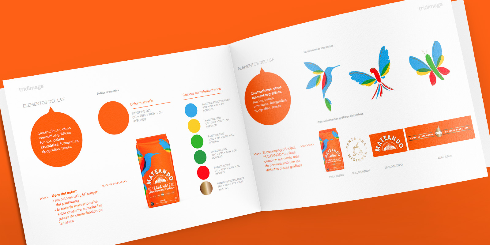
Maqueta digital de un manual de marca para yerba Mateando, mostrando códigos de color, elementos gráficos como un colibrí y un empaque naranja destacado, junto a su paleta cromática. Diseño de packaging por Tridimage.

2. The Solution

Creating a Visual System with Unique Personality

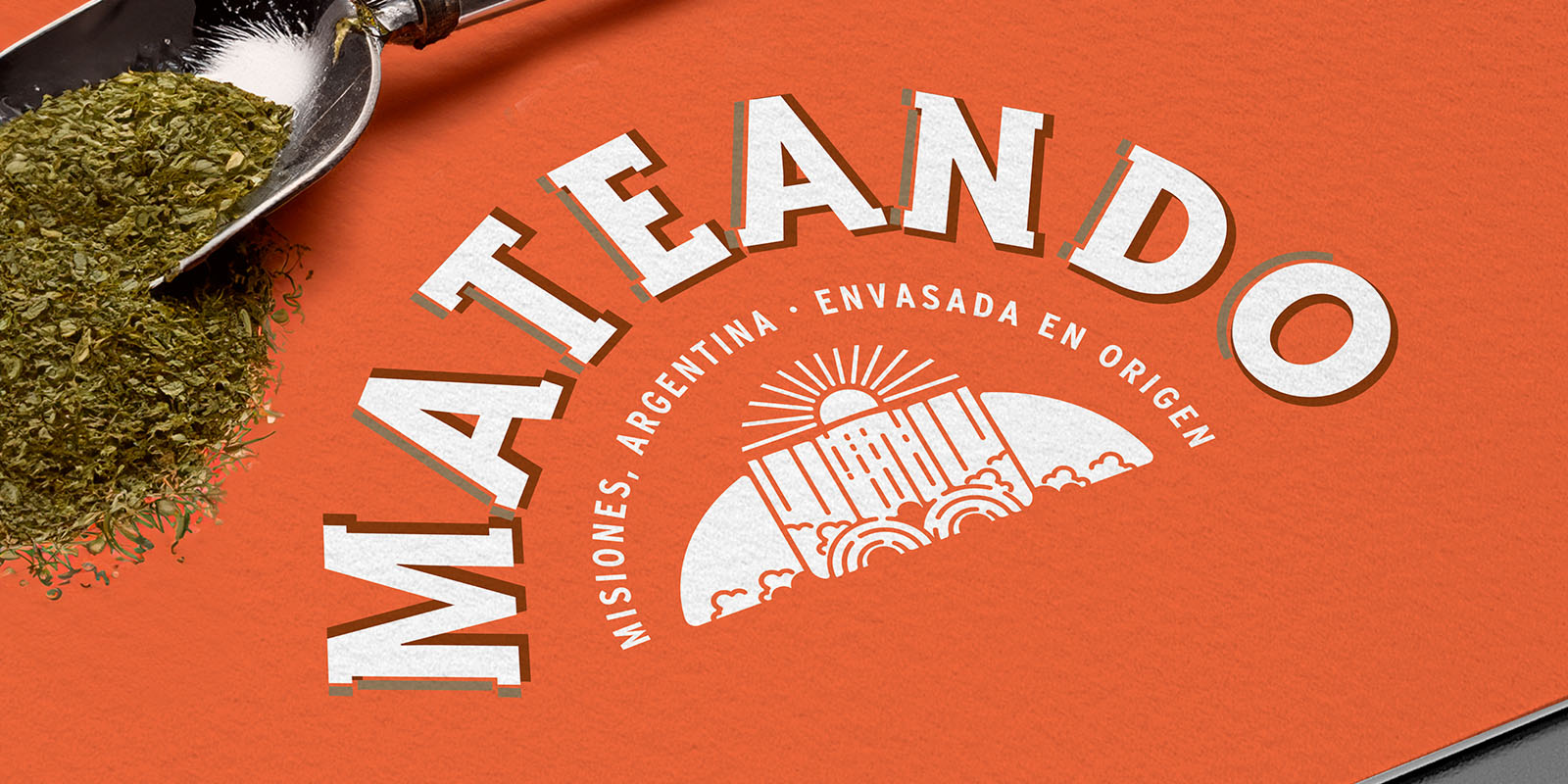
We developed packaging design that breaks traditional category codes. The graphic system combines distinctive assets like the hummingbird, a unique color palette in the category, and custom-created typography for the brand. The selection of a recyclable monomaterial structure with matte finish added differential value, providing a distinct tactile experience.

We deliberately avoided conventional solutions, opting for bold design that reflected the company's essence. The result is a brand identity that works both commercially and aesthetically: each element was designed to attract attention at the point of sale and emotionally connect with the audience, with a personality unlike any competing brand.

Segunda Gallería del Imágenes

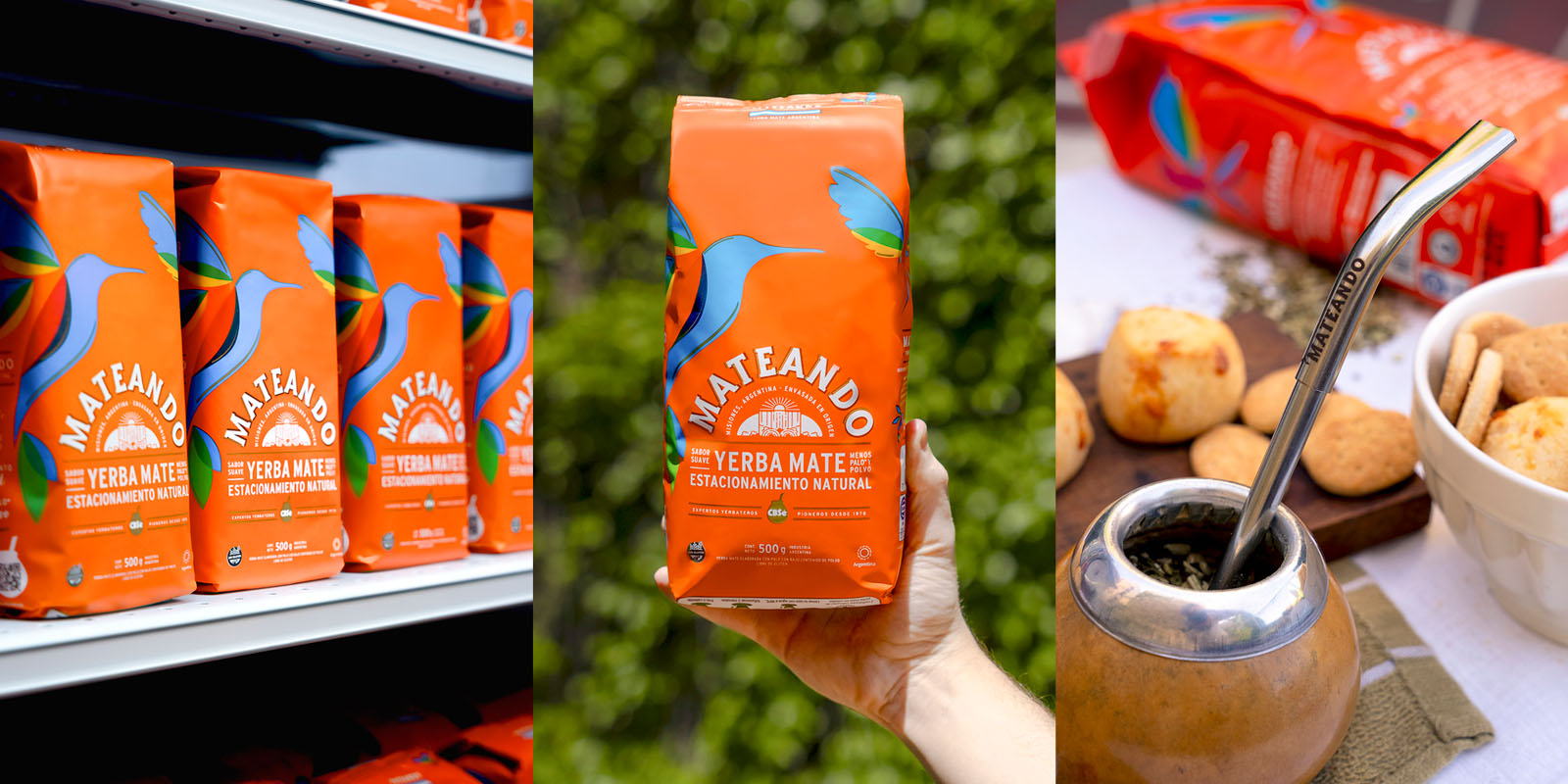
Mosaico de tres imágenes: paquetes de yerba mate Mateando en góndola de supermercado, un paquete sostenido por una mano frente a fondo verde, y un mate servido con bombilla grabada con el logo Mateando junto a galletas y pan de queso. Diseño de packaging por Tridimage.
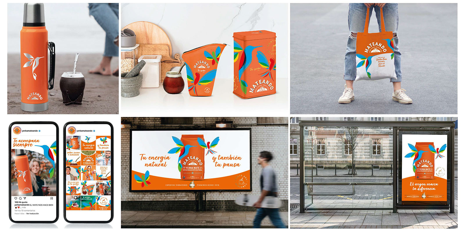
Collage de maquetas digitales mostrando publicidad y merchandising de yerba mate Mateando, incluyendo termos, bolsas reutilizables, latas decorativas, publicaciones en redes sociales y carteles publicitarios en exteriores. Diseño de packaging por Tridimage.

3. The Results

A Brand That Promises Happiness in Every Mate

The launch of Mateando marked a milestone in Establecimiento Santa Ana's strategy to expand their market presence. The product presentation generated surprise and positive feedback among retailers.

The new graphic identity successfully materialized the proposed objectives: standing out on shelf with a different proposal and building its own identity without yielding to convention.

Finally, we developed a Look & Feel and brand guidelines enabling Mateando's creative team to expand their communication ecosystem across social media and points of sale. This establishes a consistent presence for a product just beginning its market journey.

Being genuine is part of our products' success. You don't want to look like anyone else - you want to have your own place and identity. And I see that in Mateando. We wanted it to be joyful, to speak to young-spirited people, and the packaging fulfills our purpose as a company.
Sol Orquera

Sol Orquera CEO of Establecimiento Santa Ana